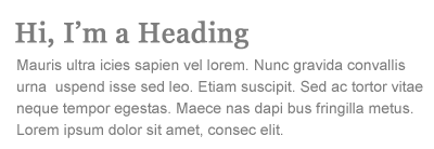
Contrast is a very important element in design that most of the time we take for granted. It helps with the organization of the page and also with the legibility and readability. Contrast in the case of size would be when the headings are put at a bigger size than the body text.

This creates contrast thus separating the different page elements. Another form of contrast would be with different typefaces or styles.

Italic and bold faces set them apart from the rest of the text creating contrast just as serif typefaces can be used for headings and sans-serif for the body text.
Contrast can also be used when all the text has the same typeface with changing the cases. Uppercase often draws more attention than lowercase and is thus more suitable for headings. The CSS property to change the case size is
text-transform: uppercase.
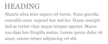
Try to avoid using uppercase in the body text or in a long sentence because it will reduce readability.

Color is another tool for contrast. It helps define different elements of the page and sets things like links apart from the rest of the text. Contrast in terms of color is also found between the color of the text and the color of the background. The colors should differ enough, have enough contrast, to make the text legible. If two pastels are used, like pale blue and pink, then the contrast isn't high enough to make the text easily discernible. An easy way to check the contrast between the type and the background, if ever unsure, then bring the page into a picture editor and view the page in Grey-scale. If you can easily read the text and discern it from the background then the contrast is high enough to make the page easy to read.

There is a debate as which is easier to read, light text on a dark background or dark text on a light background. I find that both are easy to read but in some cases one is easier than the other. If I'm in a dark room sitting at a computer screen late at night then the one that will be easier on my eyes would be white text on a black background as this will have less illumination from the computer screen. When I'm reading text in the day then the regular method, black text on a white background, is easier on my eyes. It also depends on whether the person has a lack of sleep or their disposition at the time. At least from my experience.
 This creates contrast thus separating the different page elements. Another form of contrast would be with different typefaces or styles.
  Italic and bold faces set them apart from the rest of the text creating contrast just as serif typefaces can be used for headings and sans-serif for the body text.
  Contrast can also be used when all the text has the same typeface with changing the cases. Uppercase often draws more attention than lowercase and is thus more suitable for headings. The CSS property to change the case size is text-transform: uppercase.
 Try to avoid using uppercase in the body text or in a long sentence because it will reduce readability.
 Color is another tool for contrast. It helps define different elements of the page and sets things like links apart from the rest of the text. Contrast in terms of color is also found between the color of the text and the color of the background. The colors should differ enough, have enough contrast, to make the text legible. If two pastels are used, like pale blue and pink, then the contrast isn't high enough to make the text easily discernible. An easy way to check the contrast between the type and the background, if ever unsure, then bring the page into a picture editor and view the page in Grey-scale. If you can easily read the text and discern it from the background then the contrast is high enough to make the page easy to read.
 There is a debate as which is easier to read, light text on a dark background or dark text on a light background. I find that both are easy to read but in some cases one is easier than the other. If I'm in a dark room sitting at a computer screen late at night then the one that will be easier on my eyes would be white text on a black background as this will have less illumination from the computer screen. When I'm reading text in the day then the regular method, black text on a white background, is easier on my eyes. It also depends on whether the person has a lack of sleep or their disposition at the time. At least from my experience.


0 comments:
Post a Comment