Special Characters:
When dealing with typography for the web it is important to know about special characters. Though I have only used a select few of the special characters available there are hundreds that can be used with just the right code. The most common, for me, are the space character as the browser doesn't recognizes spaces and tabs when typed in the text editor, the copy right symbol, and certain hyphens and quotation marks that won't appear in the browser when typed or aren't available on the average keyboard. These include anything from fancy bullets point symbols to quotation marks to the grammatical accent marks used for different languages. To insert them you just type the code where you would generally type the character, like the space.
When dealing with typography for the web it is important to know about special characters. Though I have only used a select few of the special characters available there are hundreds that can be used with just the right code. The most common, for me, are the space character as the browser doesn't recognizes spaces and tabs when typed in the text editor, the copy right symbol, and certain hyphens and quotation marks that won't appear in the browser when typed or aren't available on the average keyboard. These include anything from fancy bullets point symbols to quotation marks to the grammatical accent marks used for different languages. To insert them you just type the code where you would generally type the character, like the space.
Hey you!
A good database of the codes for the many special characters can be found at Web Monkey's site. The link is available to the right of the page.
En & Em Dashes:
One thinks that there is only one type of dash but in truth there are many. Two in particular are the en dash and the em dash. The en dash is a dash the width of the letter n or half of the letter m. This dash is used to indicate a range of values like 1990-2009. The em dash is a dash the width of the letter m. This dash is used to indicate a break in a sentence or a thought. His friend—also an editor—thought the same thing. This is usually shown through the improper use of 2 consecutive dashes.
Quote Marks:
When dealing with typography for the web there are two types of quote marks. There are directional or "curly" quote marks and then there are the neutral quote marks. The neutral quote marks are those that can be found on the keyboard when coding for the web. They sometimes appear as "curly" marks but often the "curly" marks need to be specified. The neutral marks are used to indicate units of measurement, like 2in=2". The "curly" or directional marks are the proper quotation marks when quoting a line of text.
When working with text it is important to be sure that there are no abandonment issues. These include widows, orphans, and hyphenation. A widow is when a single word is left on its own line either at the beginning or end of a paragraph. An orphan is when a line of text has its own line either at the beginning or end of a paragraph. Hyphenation is that annoying little property that cuts words in half at the end of a line and wraps the other half of the word to the next line. Though hyphenation is acceptable when working with a limited amount of space but it has its limits. If there isn't enough of the word on either line then hyphenation is inappropriate and breaks up the word at improper intervals. All of these are important to look for and regulate or the flow of text can be disrupted.
 Columns and Baselines:
When working with columns and baselines always keep them even. One column should not be wider than the other. The baselines of the columns should also be as even as possible. If these were uneven then the flow of the design would be disrupted with widows and orphans.
Uppercase and Small caps:
Some important techniques for space in text are kerning, tracking, and leading. Kerning is the adjustment of horizontal space between individual characters in a line of text. Without kerning some letter combinations can look awkward. I find that I do a lot of kerning in image editors and will most likely begin to use it in CSS. There are currently no CSS properties specifically designed to kern. You can, however, use the span element and class attribute to adjust the space of certain letters. This may seem tedious but it only takes a couple nudges in the right direction to fix the image of the text.
 Leading is the amount of space added between lines of text to make the document legible. The bigger the leading the more space in between each line of text and the easier it is to distinguish words. This is something that you would only adjust with certain typefaces and size combinations.
  In some cases the text can be so close together that the ascenders and descenders of the characters can cross into each other and make it hard to discern what the text is saying.
A way to fix this using CSS is the line-height property. A good example of this would be the headings of this post. I used this property to isolate the headings and make them stand out more.
Numbers and Fractions:
When working with numbers and fractions, to display these correctly within text special characters are to be used. The numerator of the fraction is to be a superscript and the denominator a subscript. This makes the numbers smaller and fit easier on the line of text with the back slash and moves them closer to it to make one "numerical character."
A good database of the codes for the many special characters can be found at Web Monkey's site. The link is available to the right of the page.
En & Em Dashes:
One thinks that there is only one type of dash but in truth there are many. Two in particular are the en dash and the em dash. The en dash is a dash the width of the letter n or half of the letter m. This dash is used to indicate a range of values like 1990-2009. The em dash is a dash the width of the letter m. This dash is used to indicate a break in a sentence or a thought. His friend—also an editor—thought the same thing. This is usually shown through the improper use of 2 consecutive dashes.
Quote Marks:
When dealing with typography for the web there are two types of quote marks. There are directional or "curly" quote marks and then there are the neutral quote marks. The neutral quote marks are those that can be found on the keyboard when coding for the web. They sometimes appear as "curly" marks but often the "curly" marks need to be specified. The neutral marks are used to indicate units of measurement, like 2in=2". The "curly" or directional marks are the proper quotation marks when quoting a line of text.
“To be, or not to be: that is the question.”
Widows, Orphans, and Hyphenation:When working with text it is important to be sure that there are no abandonment issues. These include widows, orphans, and hyphenation. A widow is when a single word is left on its own line either at the beginning or end of a paragraph. An orphan is when a line of text has its own line either at the beginning or end of a paragraph. Hyphenation is that annoying little property that cuts words in half at the end of a line and wraps the other half of the word to the next line. Though hyphenation is acceptable when working with a limited amount of space but it has its limits. If there isn't enough of the word on either line then hyphenation is inappropriate and breaks up the word at improper intervals. All of these are important to look for and regulate or the flow of text can be disrupted.
 Columns and Baselines:
When working with columns and baselines always keep them even. One column should not be wider than the other. The baselines of the columns should also be as even as possible. If these were uneven then the flow of the design would be disrupted with widows and orphans.
Uppercase and Small caps:
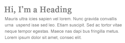
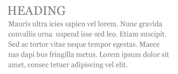
When working with headings, one way to make them stand out and increase contrast would be to have it in uppercase. Another trick to stylize this is to work with small caps. This is when all of the characters are uppercase but the first letter in each word of the heading is taller, or has a taller cap line, than the rest of the characters in the word. This should be used sparingly but it can add a nice touch to some headings and important text. This can be achieved with font-variant: small-caps. Kerning, Tracking, and Leading:
 Kerning, Tracking, and Leading:
<span class="kern">W</span>ashington
and <span class="kern">T</span>oronto
.kern {letter-spacing: -0.1em;}
Tracking is the adjustment of the average distance between letters in a block of text. Generally this is used to give less space in between letters of large type and more space in between letters of small type to make the words more legible. Think of this as being an adjustment for a group of characters and kerning for each individual character after that. To adjust the tracking using CSS the letter-spacing property would be utilized.and <span class="kern">T</span>oronto
.kern {letter-spacing: -0.1em;}
 Leading is the amount of space added between lines of text to make the document legible. The bigger the leading the more space in between each line of text and the easier it is to distinguish words. This is something that you would only adjust with certain typefaces and size combinations.
  In some cases the text can be so close together that the ascenders and descenders of the characters can cross into each other and make it hard to discern what the text is saying.
this is an example
of negative leading
of negative leading
A way to fix this using CSS is the line-height property. A good example of this would be the headings of this post. I used this property to isolate the headings and make them stand out more.
Numbers and Fractions:
When working with numbers and fractions, to display these correctly within text special characters are to be used. The numerator of the fraction is to be a superscript and the denominator a subscript. This makes the numbers smaller and fit easier on the line of text with the back slash and moves them closer to it to make one "numerical character."
10 5/6
<span style="line-height:0em;"><sup>5</sup></span>
/
<span style="line-height:0em;"><sub>6</sub></span>
Bulleted and Non-Bulleted Lists:<span style="line-height:0em;"><sup>5</sup></span>
/
<span style="line-height:0em;"><sub>6</sub></span>
When working with bulleted and non-bulleted lists it is important to be sure that they are placed and scaled so that they stand out from the surrounding text. It is important to be able to scan a body of text and easily find and read the lists. A way to do this is to adjust the line-height property so that there is a larger amount of space in between each list item and the surrounding body of text. Another way to do this is to edit the indentation of each list item line. This can be done with a special character, adding a margin, or even adjusting the padding of each list element.


